How Scientists See the World: 10 Data Visualizations From the Atlas of Science (website access 11/1/2010)
| David Blatt | Fast Company
The following is an article from Fast Company. Read the original article here, or download a PDF of the article here.
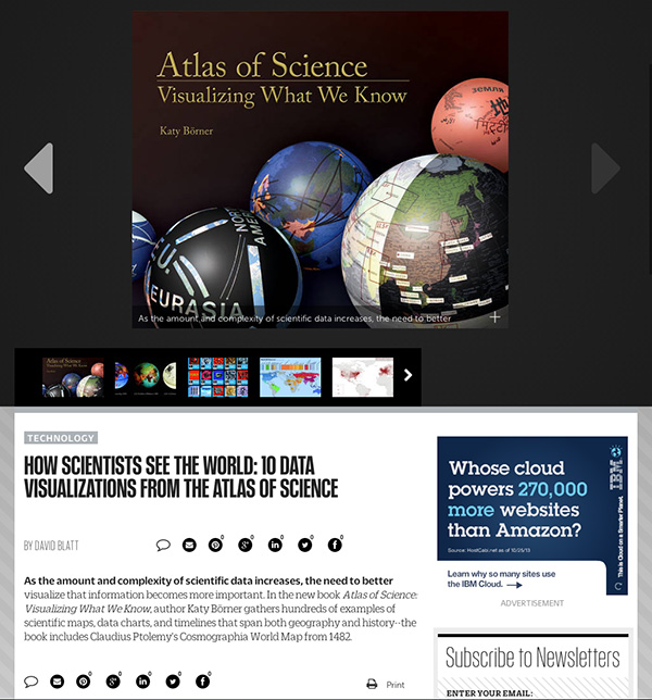
As the amount and complexity of scientific data increases, the need to better visualize that information becomes more important. In the new book Atlas of Science: Visualizing What We Know, author Katy Börner gathers hundreds of examples of scientific maps, data charts, and timelines that span both geography and history--the book includes Claudius Ptolemy's Cosmographia World Map from 1482.