Scientific Method: Relationships Among Scientific Paradigms
| Edit Staff | Seed Magazine
The following is an article from Seed Magazine. Read the original article on the web here, or download a PDF of the article here.
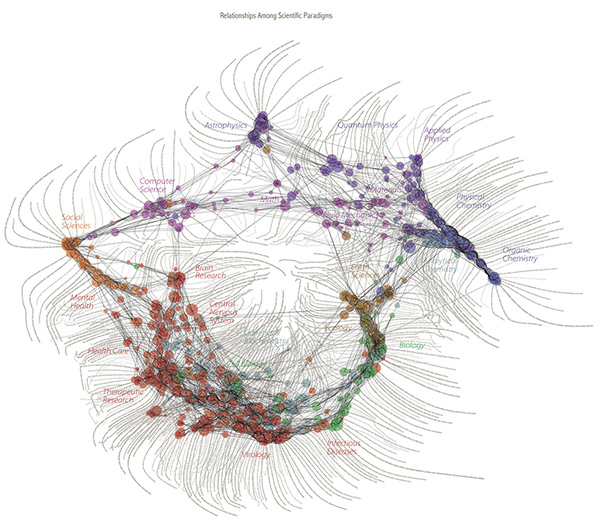
To see the full map of relationships among scientific paradigms, click here or on the image below. Note: The map is a large (8.7 MB) file and may take a while to download.
This map was constructed by sorting roughly 800,000 published papers into 776 different scientific paradigms (shown as pale circular nodes) based on how often the papers were cited together by authors of other papers. Links (curved black lines) were made between the paradigms that shared papers, then treated as rubber bands, holding similar paradigms nearer one another when a physical simulation forced every paradigm to repel every other; thus the layout derives directly from the data. Larger paradigms have more papers; node proximity and darker links indicate how many papers are shared between two paradigms. Flowing labels list common words unique to each paradigm, large labels general areas of scientific inquiry.
Information Esthetics, an organization founded by map co-creator W. Bradford Paley, is giving away 25” x 24” prints of the Map of Science. Visit the Information Esthetics site to order a free print. (Shipping and handling are not included.)