Information Visualization MOOC

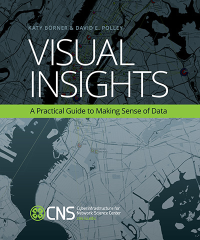
Click here to learn more about the IVMOOC companion book, Visual Insights, by Katy Börner & David E. Polley.
CNS launched its inaugural Information Visualization MOOC in January 2013, attracting participants from more than 100 countries. The course has moved from Google Coursebuilder to the Canvas platform to improve student communication and feedback, and also to facilitate gamification of learning materials. The 2015 iteration features new materials drawn from the Atlas of Knowledge: Anyone Can Map.
The course provides an overview about the state of the art in information visualization, teaching the process of producing effective visualizations that take the needs of users into account.
The target audience is graduate students able to work three to six hours per week. Students will learn basic concepts, practical skills, and team project development. Everybody who registers gains free access to the Scholarly Database (26 million paper, patent and grant records) and the Sci2 Tool (100-plus algorithms and tools).
The course can be taken for three Indiana University credits as part of the Online Data Science Program, as part of the Information and Library Science M.S. program, and as part of the online Data Science M.S. Program offered by the Luddy School of Informatics and Computing. Students seeking enrollment information should contact ilsmain@indiana.edu or datasci@indiana.edu.
It is one of the first MOOCs offered by IU and the first to offer an opportunity for students to work in teams with actual clients like researchers interested in understanding data patterns and trends, government agencies developing visual interfaces for data holdings, industry representatives looking to maximize return on investment, medical doctors seeking cures, and not-for-profit organizations hoping to communicate impacts and achievements.
Information visualization continues to broaden its reach from computer science and human-computer interaction into fields like drug discovery, financial analysis and scientific research.
Visual Insights: A Practical Guide to Making Sense of Data was released in 2014 as a companion textbook to the course. It offers a gentle introduction to the design of insightful visualizations. Each chapter has a hands-on section that demonstrates how plug-and-play macroscope tools can be used to run advanced data mining and visualization algorithms. The final two chapters present case studies and discuss future developments. Learn more about the book and see a preview here.


