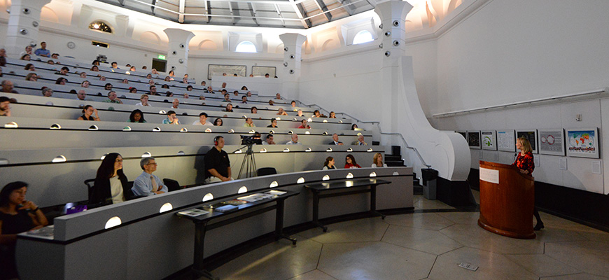
Katy Börner introduces the Places & Spaces exhibit at the University of Miami, September 4, 2014.
The Places & Spaces exhibit aims to demonstrate the power of maps to navigate and make sense of physical places and abstract topic spaces. Scientists will be stimulated, students and teachers encouraged, and the general public fascinated by this multi-layered, accessible approach to the worlds of modern scientific thought.
The exhibit debuted in 2005 with the goal of creating 10 iterations of 10 maps each, totaling 100 maps by 2014, in an effort to showcase the most fascinating examples of data visualization from around the globe. The 100-map goal was realized in September 2014 when the 10th iteration debuted at the Unviersity of Miami, marking the first time all 100 maps were displayed together.
The maps that make up the exhibit have been chosen by a team of international reviewers and exhibit advisors. Of the dozens of maps submitted each year, only the top-10 are chosen. After being prepared for printing, the finished maps are included in an exhibition for public display at libraries, science museums, and national science academies around the globe.
Over the years, Places & Spaces has appeared at some of the world’s most renowned institutes of knowledge and learning, like the National Academy of Sciences, Stanford University, the Chinese Academy of Sciences, University College Dublin, and many more. See a complete list of venues with photos here.
In addition to printed maps, the exhibit also takes the form of large format digital displays and bonus elements like Ingo Günther's WorldProcessor globes.
Below are some examples of the finest science maps in the exhibit. Click the images to see the zoomable maps and read more about them at scimaps.org.
In Terms of Geography
by André Skupin
André Skupin’s research interests focus on geographic visualization, cartographic generalization, data mining, and information visualization. This map was computed from more than 22,000 abstracts submitted to the annual meetings of the Association of American Geographers during a ten-year period from 1993 to 2002. The methodology is centered around the representation of each document as an n-dimensional vector of terms.
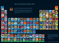
Visual Periodic Table of the Elements
by Murray Robertson & John Emsley
No chemistry textbook, classroom, auditorium, or research laboratory is complete without a copy of the periodic table of the elements. Since the earliest days of chemistry, attempts have been made to arrange the known elements in ways that revealed similarities between them. However, it required the genius of Mendeleev in 1869 to see that arranging elements into patterns was not enough; he realized that there was a natural plan in which each element has its allotted place.
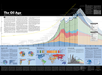
The Oil Age: World Oil Production 1859 to 2050
by Rob Bracken, Dave Menninger, Michael Poremba, and Richard Katz
Writer Rob Bracken, graphic artist Dave Menninger, statistician Michael Poremba, and catalyst Richard Katz created The Oil Age chart to communicate the central role of fossil fuels—especially oil—in the rise and continuing existence of industrial civilization. Virtually everything we consider modern—from cars to air travel to plastics—depends on the empowering force of petroleum, the most energy-dense and versatile substance known to man.
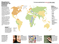
A Global Projection of Subjective Well-being
by Adrian White & the National Geographic EarthPulse Team
EarthPulse by National Geographic is a visual guide to global trends. It explores our complex connections with vivid and informative imagery, maps, diagrams, and interactives to illuminate where we are today, how we got here, and how our actions may affect the future of life on Earth. The very first issue of EarthPulse features a global map of subjective well-being (SWB).
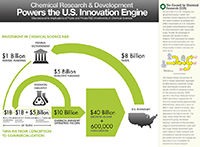
Chemical R&D Powers the U.S. Innovation Engine
by the Council for Chemical Research
The Council for Chemical Research (CCR) commissioned expert economists to conduct a two-phase study, published in 2005 as Measure for Measure: Chemical R&D Powers the U.S. Innovation Engine, on the quantitative impact of research and development (R&D) in the chemical sciences. Using patent and scientific literature, a 20-year timeline from basic research to market was determined.
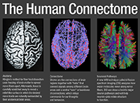
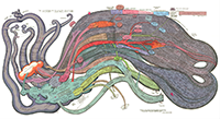
The Human Connectome
by Patric Hagmann and Olaf Sporns
The image on the left shows a dissection of a human brain, performed by Eugen Ludwig and Josef Klingler from post-mortem tissue. The dissection reveals major anatomical features of the brain, but it does not reveal the brain’s connections. Shown on the right is a complete map of the major anatomical connections linking distinct regions of the cerebral cortex.
History of Science Fiction
by Ward Shelley
Ward Shelley is an artist identified with the Williamsburg scene in Brooklyn, New York. His work includes a series of diagrammatic paintings and graphical chronologies that illustrate the interweaving of historical narratives about art and culture. This map plots the science fiction literary genre from its nascent roots in mythology and fantastic stories to the somewhat calcified post-Star Wars space opera epics of today.
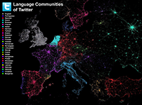
Language Communities of Twitter
by Eric Fischer
Languages divide and unite. Eric Fischer majored in linguistics in college before becoming known for making maps, and he combined the two to make this map of Twitter activity around the world. Shown are geotagged tweets from May 14 to October 20, 2011, recorded using the Twitter streaming API. Each dot is a tweet.
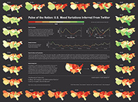
Pulse of the Nation
by Alan Mislove, Sune Lehmann, Yong-Yeol Ahn, Jukka-Pekka Onnela, and James Niels Rosenquist
Every second, up to tens of thousands of tweets are composed. Individually, each tweet is mostly interesting to friends or fans of the tweeter. But taken together, they add up to something more. This map studies the mood of over 300 million public tweets in the U.S. sent between September 2006 and August 2009.
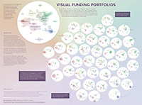
Visual Funding Portfolios
by Moritz Stefaner, Mario Diwersy, and Christian Herzog
Designed by data visualization designer Moritz Stefaner, data analyst Mario Diwersy, and research strategist Christian Herzog, this map characterizes the portfolios of 23 funding agencies active in 2012. Publicly available data on funded projects was downloaded and each project was classified using the Research Condition and Disease Classification (RCDC) by the U.S. National Institutes of Health.