Visualizations
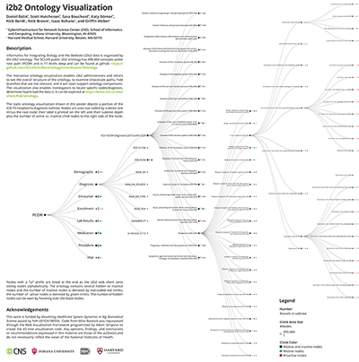
i2b2 Ontology Visualization
Informatics for Integrating Biology and the Bedside (i2b2) data is organized by the i2b2 ontology. The SCILHS public i2b2 ontology has 490,484 concepts under root path \PCORI and is 11 levels deep. The interactive ontology visualization enables i2b2 administrators and others to see the overall structure of the ontology, to examine (in)activate paths, hide branches that are not relevant, and it will soon support ontology comparisons. The visualization also enables investigators to locate specific codes/diagnosis, determine how broad the data is.
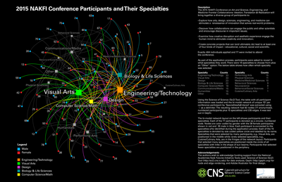
2015 NAFKI Conference Participants and Their Specialties
The National Academies Keck Futures Initiative (NAKFI) is a program of the National Academies of Sciences, Engineering and Medicine supported by the W.M. Keck Foundation. Every year, NAFKI brings interdisciplinary researchers together to work in task groups and challenge teams to tackle tough real-world problems through innovative, outstanding communication and cooperation among disciplines.
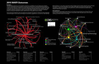
2015 NAFKI Outcomes
The National Academies Keck Futures Initiative (NAKFI) is a program of the National Academies of Sciences, Engineering and Medicine supported by the W.M. Keck Foundation. Every year, NAFKI brings interdisciplinary researchers together to work in task groups and challenge teams to tackle tough real-world problems through innovative, outstanding communication and cooperation among disciplines.
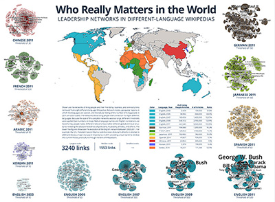
Who Really Matters in the World—Leadership Networks in Different-Language Wikipedias
Articles about people in Wikipedia include many social cues about a particular person. In the English Wikipedia there is a category called “Living People” which includes articles of people currently alive. To construct the social network of living people, computer scientists Peter A. Gloor and Keiichi Nemoto collected each article’s contents and extracted the internal links to other living people articles. Similar to the Google page rank algorithm, this linking structure reveals which person is more prominent from the Wikipedians’ perspective. The ratio between in-degree and out-degree was used as a metric of importance for the popularity, power, or importance of the person described in the article. Shown here are networks from eight different-language Wikipedias of people who were still living as of 2011. The geospatial regions where these languages are spoken are color-coded (see world map, table, and networks). Because the size of the original networks was too large, only people articles having more than a predefined number of incoming links are included, in addition to peripheral articles that have a direct link to them. To animate the evolution of the English Wikipedia network, living people articles were collected and analysed for different points in time. To explore the networks interactively, visit http://www.ickn.org/wikimaps.
CNS's contribution: Research Assistant Ted Polley generated the networks from Gloor's data, and Senior UX Designer Samuel Mills designed the map.
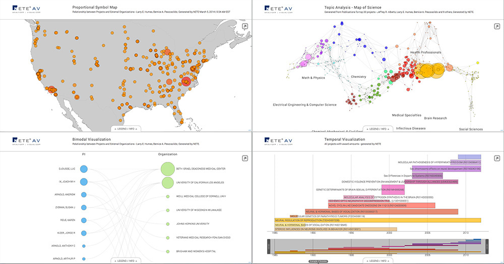
NETE Analyzer/Visualizer
Our development team has been collaborating with NET ESOLUTIONS on an NIH-funded SBIR Phase II project that will result in a major overhaul of the NETE Analyzer/Visualizer, a web-based data visualization tool originally developed in 2012 and used by NIH program officers. The all-new responsive interface scales effortlessly from desktop to tablet browsing and boasts several new features aimed at optimizing a variety of visualization types for effective communication of the insights inherent in the data. This project created Geographic, Temporal, Bimodal, and Map of Science visualizations based on existing Sci2 visualizations and conventions. Each vizualization provides different insights into NIH grant, project, and publication data, and provide multiple forms of interaction, allowing users to pan, pinch- or scroll-zoom, and click individual nodes or clusters to gain more detailed information. NETEAV 1.7.1 was released in October, 2014, and incorporates both back- and front-end changes to the NETEAV system to produce scale-free and responsive visualizations for four visualization types for the full range of data NETEAV provides.
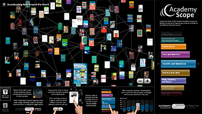
AcademyScope
AcademyScope is the product of a collaboration between CNS and the National Academy of Sciences in Washington, DC. It offers viewers a means to explore all reports published by the National Academy of Sciences, National Academy of Engineering, Institute of Medicine, and National Research Council—from twenty years ago to today.
The "Automatic Mode" of the visualization shows the 100 most frequently downloaded reports of the previous seven days as well as newly released reports. Displayed downloads, including download totals, are current within the minute. The "Interactive Mode" supports browsing and exploration by topic, subtopic, and individual report. Users can select a topic on the right to reveal all of its subtopics, and touch one of the subtopics to display all reports in that area and their relatedness to each other. (Links between reports are automatically generated based on the incidence of shared key terms and phrases.) Touching any report brings up detailed information on the right side of the display. There's also a QR code that allows users to download a PDF of the report to their smart device.
Beginning October 24, 2014, a web version of AcademyScope is available to the public on the National Academies Press website. Visitors can access it from the "Browse by Topic" menu on the NAP homepage, or via the "Browse Topics" button in the header on every interior page. The application can also be accessed directly at www.nap.edu/academy-scope.
Acknowledgements: Katy Börner (initial concept, design & interactivity consultation), Chin Hua Kong (lead software developer), Samuel Mills (graphic design), Adam Simpson (programming), Bhumi Patel (programming), Rohit Alekar (programming).

A Semantic Landscape of 2,300 Medical Subject Headings
By Joseph Biberstine, Russell J. Duhon, Jennifer R.S. Coffey, Katy Börner, Cyberinfrastructure for Network Science Center, Indiana University, Bloomington, and André Skupin, San Diego State University. Read the accompanying paper, Visualizing the Topical Structure of the Medical Sciences: A Self-Organizing Map Approach, by André Skupin, Joseph R. Biberstine, and Katy Börner.
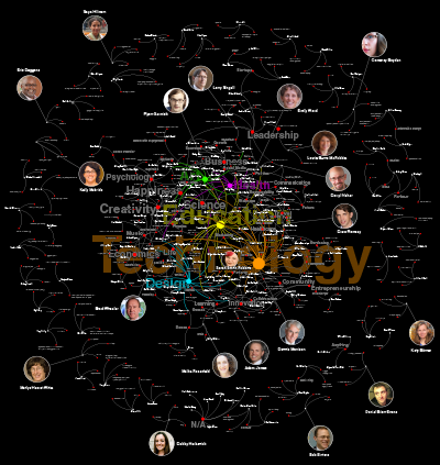
TEDxBloomington Map of Registrations
Shown here are all TEDxBloomington attendees who registered by March 8, 2013 together with the subjects they like 313 subject nodes in colors. People are linked via popular topics. The resulting bi-modal network has 508 nodes connected by 553 edges. It is dominated by the “Technology” (listed 33 times), “Education” (21), “Art” (13), “Design” (12), “Health” (11) nodes. Sizes of subject nodes and labels correspond to the number of attendees who listed them. The densely connect core of the network, also called giant component, is surrounded by smaller networks. For a long time, only one person wanted to talk about “Beer” and this was the only subject he wanted to talk about (top center). Only recently, another registration interconnected “Beer” with “Startups” and from there to other people and subjects in the network. Portraits of the speakers from this year’s conference are placed by their subjects of interest. A listing of all subjects and their counts is given in the lower left.
Illuminated Diagram Display
The Illuminated Diagram features a geographic map and a science map controlled by a touch panel, which allows users to learn what areas of science are producing the most publications, and where in the world this research is coming from. The display features research and node layout by Kevin W. Boyack and Richard Klavans, data preparation by Chin Hua Kong and Nianli Ma, layout and design created by Michael J. Stamper and Katy Börner, and programming provided by Jagannathan Lakshmipathy and David M. Reagan. The original design, cartography, and programming were created by W. Bradford Paley, John Burgoon, and Peter Kennard.
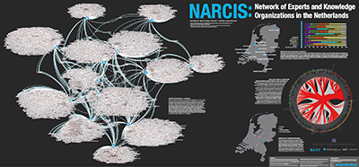
NARCIS: Network of Experts and Knowledge Organizations in the Netherlands
for Data Archiving and Networked Services (DANS), Royal Netherlands Academy of Arts and Sciences (KNAW), by Linda Reijnhoudt, Michael J. Stamper, Katy Börner, Chris Baars, and Andrea Scharnhorst.
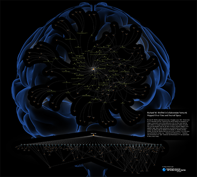
Richard M. Schiffrin's Collaboration Network Mapped Over Time and Journal Space
for A Festschrift for Richard M. Shiffrin, by Katy Börner and the Cyberinfrastructure for Network Science Center. Graphic design by Michael J. Stamper.
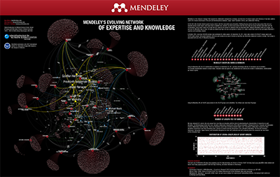
Mendeley's Evolving Network of Expertise and Knowledge
for the 2011 Mendeley Binary Battle, by Chin Hua Kong, Katy Börner, and Michael J. Stamper
Shortlisted submission in the 2011 International Institute for Information Design (IIID) Awards in the Didactics category.
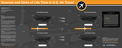
Sources and Sinks of Life Time in U.S. Air Travel
for Sunbelt 2011, by Joseph R. Biberstine, Katy Börner, and Michael J. Stamper
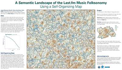
A Semantic Landscape of the Last.fm Music Folksonomy using a Self-Organizing Map
for Sunbelt, 2010, by Joseph Biberstine, Russell J. Duhon, Katy Börner, Elisha Hardy, CNS and André Skupin, San Diego State University
Shortlisted submission in the 2011 International Institute for Information Design (IIID) Awards in the Didactics category.

Bibsonomy Anatomy
2009, By Nianli Ma, Russell J. Duhon, Elisha F. Hardy, Katy Börner
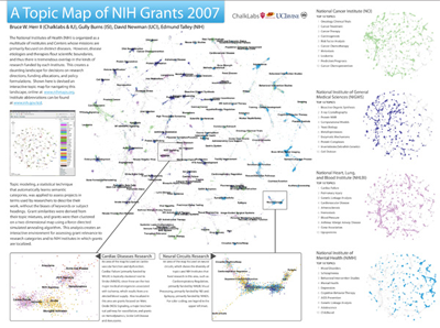
A Topic Map of NIH Grants 2007
by Bruce W. Herr II, David Newman, Gully APC Burns
Society for Neuroscience, 2006 Visual Browser
by Bruce W. Herr II, David Newman, Gully APC Burns

Research Collaborations by the Chinese Academy of Sciences
by Weixia (Bonnie) Huang, Russell J. Duhon, Elisha F. Hardy, Katy Börner, Indiana University, USA
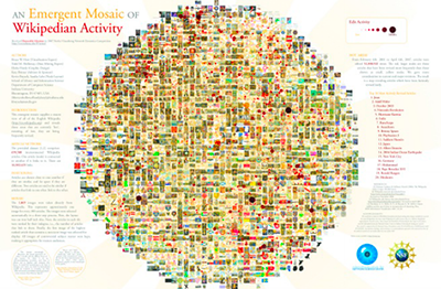
An Emergent Mosaic of Wikipedian Activity
by Bruce W. Herr II, Todd Holloway, Katy Börner
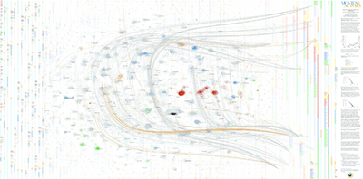
Movies and Actors: Mapping the Internet Movie Database
by Bruce Herr, Weimao Ke, Elisha Hardy, Katy Börner