After 10 years and 100 maps, IU-based 'Mapping Science' project winds down with biggest show ever
| IDS News

The following is an article from the IDS News. You can read the original article here, or download a PDF of the article here.
BLOOMINGTON, Ind. -- "Places and Spaces: Mapping Science" has been a labor of love for Indiana University’s Katy Börner and her colleagues. Over the past 10 years, the information visualization specialist has led in the curation of 100 maps created by 236 mapmakers -- from 68 cities in 16 countries -- who represented 30 different scientific disciplines.
The project -- creating 10 new maps each year that take a unique macroscopic look at some form of scientific or human activity -- began its formal curtain call last week at the University of Miami in Coral Gables, Fla., on a spectacular note: It is the first time all 100 maps have been on display at one time.
From broad research topics to niches and novelties, the maps include:
- Locations and intensities of hurricanes over the past 160 years
- Hands-on science maps for kids
- The environment
- The history of science fiction
- U.S. patents
- Research literature on autism
- Movie character interaction charts, including "Lord of the Rings"
- The state of the polar bear
- A visualization of cross-references in the Bible
If hung side by side, the maps would stretch the length of two football fields. Taking just 30 minutes to talk about each map and its makers -- which Börner believes is the minimum time it takes to tell all the stories and unravel all the insights that come with each of the maps -- would fill 50 hours.
Coordinated from IU’s Cyberinfrastructure for Network Science Center, which Börner directs, annual iterations of the collection have been displayed at more than 250 venues in 23 countries and on six continents. From the New York Public Library to the National Science Library of the Chinese Academy of Sciences, as a mobile exhibit on a passenger train across Germany called The Science Express and at the National Academy of Sciences in Washington, D.C., “Places and Spaces: Mapping Science” has served as an ambassador communicating the structure, dynamics and beauty of the science and technology landscape to audiences of all ages and from all walks of life.
Börner, IU’s Victor H. Yngve Professor of Information Science at the School of Informatics and Computing, said the maps were designed to help viewers make sense of the avalanche of data being generated by scientists today by placing it into a visual, tangible context suited to serve as an aid to navigating, understanding and communicating knowledge.
“Maps have guided mankind’s explorations for centuries," she said. "In the information age, key opportunities for discovery and innovation reside in knowledge and expertise spaces, and maps of science help us navigate, manage, understand and exploit these spaces.”
While search engines can retrieve facts from an ocean of data, they cannot answer larger questions about the seascape as a whole, she said. “How big is this ocean? How can we navigate to the useful islands of knowledge? How is knowledge interlinked on a global scale? In which areas is it worth investing time, effort and compassion?”
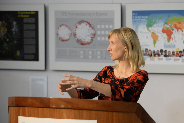
Börner kicked off the latest exhibit with a keynote address at University of Miami’s School of Architecture, which served as the lead-in to an entire semester of lectures at the campus about visualizing data and its confluences with the arts, sciences and everyday life. Following the University of Miami exhibition, "Places and Spaces" will travel to Northwestern University in Chicago, where it will remain on display for five months.
First shown at the Annual Meeting of the Association of American Geographers in April 2005, the exhibit’s home has always been at Indiana University. During the past two years, editor and co-curator Todd Theriault and designer Samuel Mills, both at the Cyberinfrastructure for Network Science Center on the IU Bloomington campus, worked closely with the mapmakers to prepare the maps for a general audience, refining the designs to make them easier on the eyes and more intuitive for the lay person.
The large-scale, high-resolution maps were printed in rich color by printer and photographer Kendall Reeves of Spectrum Studio in Bloomington. Custom furniture builder Dolan Cleverley, also of Bloomington, designed and fabricated the shipping crates in which the maps and interactive elements of the exhibit travel. Lisel Record, the exhibit manager at the Cyberinfrastructure for Network Science Center, is responsible for venue acquisition and logistics surrounding shipment of the many crates and the display of the exhibit in venues around the globe.
Several IU faculty and staff members were also among the mapmakers:
- David E. Polley, a social sciences librarian at Indiana University-Purdue University Indianapolis' University Library, worked with Mills to create “Who Really Matters in the World -- Leadership Networks in Different-Language Wikipedias.”
- IU graphic designer Michael J. Stamper was one of the collaborators on the “Knowledge Web” map.
- Assistant professor of informatics Y.Y. Ahn collaborated on “Pulse of the Nation,” a map of time-stamped mood variations across the U.S. based on Twitter use.
- Professor of geological sciences Michael W. Hamburger was an author of the “Tectonic Movements and Earthquake Hazard Predictions” map.
- Provost Professor of Psychological and Brain Sciences Olaf Sporns co-authored the “Human Connectome” map.
Now that 10 years have passed and 100 maps created, the exhibit team and an international advisory board will endeavor on Phase II of the exhibit: a focus on interactive tools and online services that empower users not only to read maps but to make their very own data visualizations and to use them in informed decision making. An information visualization massive open online course that Börner will teach again in spring 2015 gives a first glimpse of the power of visualization to create actionable insights.


