Image of the Week-A Map of All Things Science
| International Science Grid This Week
The following is an article from International Science Grid This Week. Read the original article on the web here, or download a PDf of the article here.
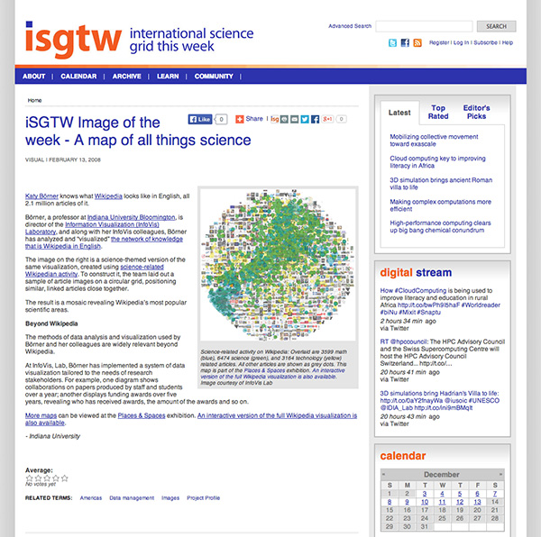
Katy Börner knows what Wikipedia looks like in English, all 2.1 million articles of it.
Börner, a professor at Indiana University Bloomington, is director of the Information Visualization (InfoVis) Laboratory, and along with her InfoVis colleagues, Börner has analyzed and “visualized” the network of knowledge that is Wikipedia in English.
The image on the right is a science-themed version of the same visualization, created using science-related Wikipedian activity. To construct it, the team laid out a sample of article images on a circular grid, positioning similar, linked articles close together.
The result is a mosaic revealing Wikipedia’s most popular scientific areas.
Beyond Wikipedia
The methods of data analysis and visualization used by Börner and her colleagues are widely relevant beyond Wikipedia.
At InfoVis, Lab, Börner has implemented a system of data visualization tailored to the needs of research stakeholders. For example, one diagram shows collaborations on papers produced by staff and students over a year; another displays funding awards over five years, revealing who has received awards, the amount of the awards and so on.
More maps can be viewed at the Places & Spaces exhibition. An interactive version of the full Wikipedia visualization is also available.