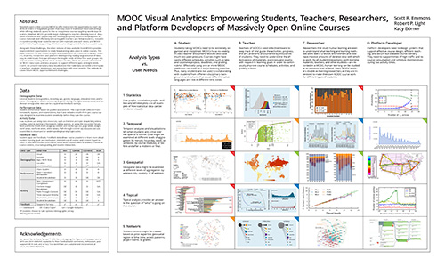
MOOC Visual Analytics: Empowering Teachers, Students, Researchers, and Developers of Massively Open Online Courses
Abstract:
Massively open online courses (MOOCs) offer instructors the opportunity to reach students in orders of magnitude greater than they could in traditional classroom settings, while offering students access to free or inexpensive courses taught by world-class educators. However, MOOCs provide major challenges to teachers (keeping track of thousands of students and supporting their learning progress), students (keeping track of course materials and effectively interacting with teachers and fellow students), researchers (understanding how students interact with materials and each other), and MOOC platform developers (supporting effective course design and delivery in a scalable way).
Along with these challenges, the sheer volume of data available from MOOCs provides unprecedented opportunities to study how learning takes place in online courses. This paper explores the use of data analysis and visualization as a means to empower teachers, students, researchers, and platform developers by making large volumes of data easy to understand. First, we introduce the insight needs of these four user groups. Second, we review existing MOOC visual analytics studies. Third, we present a framework for MOOC data types and data analyses to support different types of insight needs. Fourth, we present exemplary data visualizations that make data accessible and empower teachers, students, developers, and researchers with novel insights. The outlook discusses future MOOC opportunities and challenges.
Team:
Poster:
 Poster version of paper |
High-Resolution Figures:
 Table 1: Analysis types vs. user needs. |
|
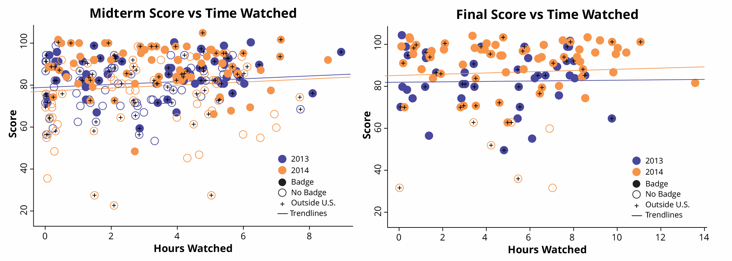 Figure 1: Scores vs. time invested watching course videos for students who took the 2013 (blue) and 2014 (orange) IVMOOC midterm (left) and final exam (right) and got at least 50% correct. Filled circles indicate students that earned a badge in the IVMOOC while unfilled circles indicate other students that took the exam. The orange and blue lines indicate the trend lines for the respective years. |
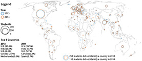 Figure 2: Proportional symbol map of the world showing the location of IVMOOC students from 2013 (blue) and 2014 (orange). Circles are area size coded by the number of students per country. Not all students reported their country and missing values are given in the lower part of the map. The top-five countries per year are listed in the lower left. |
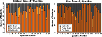 Figure 3: Student scores per question for midterm (left) and final exam (right) for IVMOOC 2014. |
 Figure 4: IVMOOC video views in 2013 (blue) and 2014 (orange) |